Thursday, December 4, 2014

Anything goes

As we are all gearing  up for the holiday season the last challenge for December at SDC 176  is Kim's "Anything goes."  You have the opportunity to enter this challenge up to five times!  That's 5x the chance to win a $30.00 gift voucher for Stampotique.

I have repurposed a Starbucks Via folder to create a pouch for a coffee gift card.  Here is Magda's "Agatha's Christmas" featured on the outside of the folder.  France's stars from her design cube are layered over a textured background.

Flatten out the folder and gesso.  Add layers of acrylic with an old gift card by scraping in all directions.  A spray of glimmer mist is added.  Double stick tape allows for a strip of glitter for Agatha to stand on.  Amy's "wish" is stamped on a cut circle and attached with fibers.
 

Wednesday, November 26, 2014

An idea for giving

Happy Thanksgiving!

Thanksgiving marks the beginning of the holiday season.  While many of you will be out shopping this weekend I hope some of you will find time to play in your studio.  Why not collect your paper scraps and color coordinate them to create a set of note cards?  What a lovely gift to create a stationery or thank you card set for a friend or loved one.

Large Fluerfly is stamped with Mementos ink and colored with markers.  Scrap paper and Pitt pen are added for these fast and easy cards.

Begin with folding a set of cards or use pre-folded ones.  Consider recycling card fronts to collage over (the card on the left is from a 'thank you' card).  Select your stamp of choice and cut squares of white to accommodate the image.  Stamp ten to a dozen squares.  Color with markers or your favorite media in a variety of color combinations.  Select scrap papers to enhance the colored image and collage.  Add Pitt pen doodles and a simple lined border.  Stack the set with envelopes and tie with a ribbon.  Insert the set of handmade cards in a cellophane sleeve.  Presto!  You have a gift without waiting in lines!

Wednesday, November 19, 2014

Stripe Background

Happy Thursday.  Corrie is setting the challenge at the Stampotique Designers' Challenge Blog and she'd like everyone to make something with a stripy background.

"You can use ink, paint or pens whatever you like, just no ready made stripes with pattern paper."

My solution was to sew stripes of rickrack and have my bouncy little taxi cab right along the bumps.
Beep beep!
 

Sunday, November 16, 2014

Altered Playing Card Challenge Catch-up

I left town after week 5 and it's been a trick to get back on track since my return.  Here are my catch-up cards!

Week 6:  Halloween theme.
Left: I used "Wishbone" from my Vera Lane Studio digi stamp set.  She's colored with Copic markers.  The background is a combination of Inktense and Neocolor wax pastels dripped and blotted.
Right:  A printed piece of cellophane (from fresh flowers wrap) is glued over Inktense color on prepared gesso.  I used a portion of my crow line rubber stamp from Stampotique printed with Stazon ink.

Week 7: Nautical/ Ocean theme.  Not.

I substituted a fairy theme from my digi image set Firefly Fairies.  They are colored with Copics with acrylic paint backgrounds.  Pitt pen and paint pens add doodles. 


Week 8:  Hearts

Left:  Inktense blocks and Prismacolor pencils make up the background.  I doodled with a fine Pitt pen for the border.  Collage scrap and a charm complete the card.
Right:  Inktense wiped with babywipes and Sharpie paint pen make up the background.  The scallop border is cut from printed deli paper.  The stamp is my "love you heart" available from Stampotique.  It's stamped with Stazon and clear embossed.

Week 9: Flowers and Stencils

Left:  Claudine used a stencil and text on one of her cards.  I cut a stencil with scrap paper for the background.  I used Gelatos and white paint pen in the stencil over an Inktense base.  The character is "Blossom" from one of my digi stamp sets.  Text stamp is the definition for "rose" -- also by Stampotique.

Right:  Claudine demonstrated how to align washi tape on paper to allow a punched circle.  I followed that technique for the inside of the doodled flowers.  I scraped the black line with the tip of an X-acto blade for a scratchy texture.  The bird is from "Bud and Birds."  I painted the flowers with acrylic paint and the bird is colored with Copic marker.

Week 10: Altered
Left:  The background is Gesso with Inktense layered with Caran d' Ache neocolor II wax pastels layered and wiped with a baby wipe.  I glued eyes from a magazine cutout and drew around it with Derwent watercolor pencils and a waterbrush.  I used a mechanical pencils for shading and an X-acto knife to scratch into the hair.
Right:  The image is from Vera Lane Studio digi images colored with Copics.  Eyes from a magazine cutout are glued in place with a tiny tag and scraps.  Scribble with pencil and paint pens in a Distress stained background.


Saturday, November 15, 2014

Documented Life Journal 2015

I'm starting my New Year's resolution early.  

In 2015 I'm going to try to take a little more time for my own art.  I share my studio with several young art students during the week.  My art form has always been assisting children in their creativity.  That in itself feeds the creative soul.  In 2015 I intend to carve out a "me" day.  Let's see how that goes.

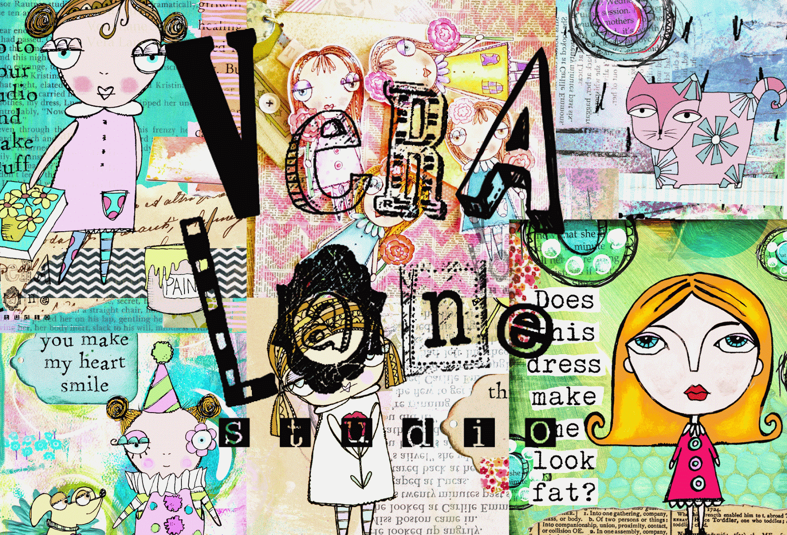
I have completed the cover of my 2015 Documented Life Journal after looking at the Cover Story Workshop at Art to the Fifth.  I looked at Roben-Marie Smith's videos and a portion of Rae Missigman's.  What I saw was so motivating that I will savor the rest of the series for inspiration later. 

My cover is mostly inspired by Roben-Marie's  example.  I collaged old letters, ledgers, patterns, and scrap paper.  I added acrylic (Martha Stewart multi-surface satin) , gesso, and layers of Inktense wiped with baby wipes.   My date was stamped with  Random Acts, an alpha-stamp set I designed for Stampotique.  I originally had the date on ledger paper exposed under an envelope window.  After a late night I noticed I transposed my numbers and had to come up with another plan.  An image floating in the bottom right corner was also not working for me.  My solution was to add the due date with a date stamp to commence the beginning of DLP 2015 .

The back cover is much of the same. I used a liner brush with black acrylic paint for my line work. 

The inside cover was screaming for some coverage.  The base of the collage is Rae's technique.  I layered over it with sequin waste stenciling, and more layers in Inktense.  I really like the transparent layers that are created by wiping it down with baby wipes.  It seems to add depth.
A small cigar box of hand carved stamps from a day working with kids were begging to be used. They were applied with Momento ink and Inktense blocks.   Sharpie paint pens and graphite pencil scribbles are added throughout.

My scallops are cut from Gelli prints on deli paper.  Deli paper is such a perfect weight to collage with.

Roben-Marie and Rae had so much more to their techniques, so I encourage you to take advantage of the workshop.  You can borrow some great ideas and incorporate your own.

Thanks for taking a peek.


Wednesday, November 12, 2014

Bringing on the bling!

France Papillon is bringing on the bling at the Stampotique Design Team Challenge

In this sample I used sequin waste with blue and black paint layers for my sky.  White paint is applied to create a scalloped border.  The glowing moon (made with one of Daniel's circle stamps) is stamped and cut on painted paper with an added layer of orange glitter glue.

France's star cluster is part of her design cube.  I stamped it with clear embossing ink and heat set with clear embossing enamel.  The stars get further bling treatment with Diamond Stickles

Agatha's moon is stamped and colored with Copic markers.  I punched the cheek in the moon to expose paper underneath.  The image is cut and mounted with glue dots.  A zigzag stictch is used to attach the composition to a black cardstock.   I used gold rhinestones to bling up the sky and complement the blue background.

Wednesday, November 5, 2014

Spotlighting

Arwen has been hostess this week at the Stampotique Designer's Challenge.  SDC172 calls for the "Spotligting" technique.  A portion of the stamped image stands out from the rest of it.

I had another sample to post this morning but I wanted to give this a whirl as it was new to me.  My studio was not my own today, as I had a few young students in and out.  I didn't put a lot of thought into this and quickly I dug out my chipboard shapes. My "spotlight" would be a heart.  I had a piece of paper that was layered from excess Gelli Plate printing with soft pastel tones.  I can't tell you why this snow family stamp came to me for this background -- perhaps the colors seems cool and icy to me. 

I stamped the snow family three times; directly on the painted background and on cardstock twice.  I fussy cut the family and glued in place.  I held the stamped snow family image up to a lamp and positioned the heart chipboard behind it to capture my spotlight image.  This portion was colored with Copics.  I thought about leaving the rest of the heart white, but added color in the background to merge with the painted paper.  The green angle of the paint appeared to be highlighting the faces.

The heart image was clear embossed.  I took a thick black Sharpie to blacken the edge of the chipboard.  The chipboard heart was glued in place.  Contrasting paper was added to create a mat. A shredded piece of cotton is tied embellishment to complete the card.

Wednesday, October 29, 2014

Happy Halloween

Happy almost Halloween!

I've been burning the candle at both ends but I will say that I am done inking new stamp images (for now) in addition to taking on new art students.  Love staying busy!

I enjoy making my fun and funky backgrounds but when you are in a crunch there is nothing wrong with reaching for scrap paper for a quick card.  This certainly is not one of my better efforts but I loved chopping off Pepper to supervise little Skullboy and Frankie on their Trick or Treating adventures.

Friday, October 3, 2014

New release-- The Cherry Street Collection by Vera Lane Studio

Vera Lane Studio has just released two new sets from the Cherry Street Collection.  Meet "The Crazy Cat Lady" and "iYoga."

Both sets come with five digi files in 300 dpi resolution.  They can be resized and flipped in MS Word for your to print, color, cut and add to your paper projects.  Size small for an ATC or larger for an art journal page.


Wednesday, October 1, 2014

Masculine theme

Today's sample is for the masculine theme at the Stampotique Designer's Challenge 167 ordered up by Kim.  I used Daniel's "Bob's in time out" and "Misunderstood" from Carol's Collection.

Thursday, September 25, 2014

Early Halloween

The Stampotique Designer's Challenge (SDC 166; Get Your Spook On) this week is calling for entries with an "Early Halloween" theme.  There are some exciting and wonderful projects the team has created for Carol's challenge.

My little collage and stamped card was inspired from a funny sentiment I saw in a card shop in Ann Arbor.  My little characters are two of my sketchy kid-art inspired Halloween kids - Corie the little witch and Frankie, the pumpkin head boy. 

Tuesday, September 23, 2014

Altered Playing Cards Week 4


Altered playing card challenge week 4.  Claudine heads the challenge and we are into week four.  With 52 small pieces of art to create it will not take long to catch up or just start with this week.  This is really a "no excuses" challenge as the canvas size is so small.

"Small homes grow tight families" is a collage with hand drawn elements.  The cloud is the waste paper from my "2 nuage" stamp that Claudine used in the challenge.  I decided just to add type with my sun by painting watercolor on an old book page.  A PITT XS pen is used for added doodles.

"Coffee is always a good idea" uses Vera Lane Studio's "City Girl" with two of the four buildings included in the set.  After a day of shopping who doesn't want to duck into a little café for a cup of joe.

Monday, September 22, 2014

Let's cover the world with glitter and pearls

 Vera Lane Studio's "Cherry Street Collection" introduces the digi stamp set Glitter and Pearls.

The Cherry Street collection features diverse characters from the original Vera Lane Studio crew.  The blue header background identifies images in this line.  These digi characters still offer an element of whimsy with a fresh style all their own.

Glitter and Pearls comes with "Beatrice", two quotes and an optional crown.  The versatile set can be used for birthdays, Sweet 16, invites, Valentine's Day, or any time you need to send a little glitter. 

Beatrice can be enlarged to create a mixed media canvas or reduced to create an ATC.  Her clean lines and open spaces makes for easy coloring and or paper piecing techniques.

Vera Lane Studio images are available for instant download.  All VLS digi stamps come to you in 300 dpi resolution .png files.  They are designed with the end user in mind to craft into your personal paper creations.

See Glitter and Pearls and the complete selection at  the Vera Lane Studio Shop.


Friday, September 19, 2014

Altered Playing Card Challenge; week 3


This is week 3 of Claudine's Altered Playing Card Challenge.  If you have not jumped on board, now is a time to start.  My goal is to respond to the challenges with a digi stamp and a rubber stamp each week.

Claudine used alcohol inks and Tim Holtz's Distress Ink for her backgrounds using a fall and a Steampunk theme.

For "Fall Coat" I used mustard seed and spiced marmalade Distress Inks over gesso.  The digi images are from the Cherry Street Collection in my Vera Lane Studio Etsy shop, Classy and Fabulous.  She is colored with Copic markers.  I used BIC white out pen for white embellishments.

The background of the second card has the same color distress inks.  My number stencil does not show in the picture, but I also used brushed corduroy.  I'm not much of a Steampunk fan so putting this together took some thought.  I had an old watch cube from Post-modern Design that I had never used from years ago --  out it came.  The Mad Hatter is part of my Alice in Wonderland series for Stampotique.  I didn't have any gears so I cut circles and used a stamp edge scissor to make the grooves and colored with metallic marker. I used white Prismalcolor to accent my design elements.

I love this challenge -- for my time commitment the size of the art is just perfect.  Its a great way to try new techniques, push the envelope and experiment.   

Wednesday, September 17, 2014

Just one stamp

Happy Thursday.

Sam over at the Stampotique Designers Challenge is requesting we use just one stamp.  Jo Capper-Sandon's "Jasmine" is such a lovely stamp, it really doesn't need anything else.

I stamped Jasmine with Staz-On in jet black and used clear embossing powder. She is colored with Copics. The background is a combination of paint stains and inks over a gesso using an old credit card.  Jasmine leans on a piece of floral washi tape, anchored with a strip of patterned paper.

Tomorrow I will be posting two altered playing cards for Claudine's Altered Playing Card challenge.  So check her challenge out and come back tomorrow.

Monday, September 15, 2014

New image Monday


Two new image sets are active in the Vera Lane Studio Etsy shop!  "The Love Boat" is a whimsy four image set that can be used for anniversaries, weddings, engagements, invites etc.  It features two little cats (one with sailor hat) in their love boat with moon man and two sentiments.  Scroll down and see what the talented Jane Wetzel created with this set!

Then there is "Classy and Fabulous" from my new "Cherry Street Collection."  I think of this new collection as the "Real Housewives" of Vera Lane.

Olive is standing with her handbag with three optional sketchy florals to pop into her scene.  " A girl should always be Classy and Fabulous" quote is included.
Print out the sentiments from all your sets and make up new phrases.  Always endless possibilities with Vera Lane Studio sets.

Special thanks to Jane Wetzel for creating the fabulous sample for the "Love Boat" set. 

I hope the new image sets give you a smile. 


Wednesday, September 10, 2014

Sleeping patterns

I've been working on a normal sleeping pattern.  It's so hard to turn off my brain at night.  Kira Nichols' sick kitty reminds me how I feel when the clock reports it's not yet time to wake up!

This week's Stampotique designer's challenge calls to use an animal or bird.  It was hard to select one from Stampotique's great assortment. As soon as I picked up "sick kitty" I knew I had to create a paper pieced bed for him.  It was a little tedious (especially his tiny pillow) but I really got a kick out of making the bed with assorted patterns.

The background is acrylic on gesso with newspaper transfer.  I thought is was a perfect backdrop for sick kitty to be floating into yet another sleepless night.

Hope it gives you a smile.
 

Monday, September 8, 2014

Altered playing card challenge

Claudine Criner is sponsoring the Altered Playing Card Challenge.  This is the second week of the challenge, last week prepping 52 playing cards with gesso or sanding. You can also find the group on the FaceBook site.  If you are daunted by prepping 52 cards at once gesso doesn't take long to dry, so you can make them week to week.

For my first card I kept with the theme and colors.  I used my Stampotique's large Fleur Fly rubber stamp and had to improvise the black border.  My card was treated with clear gesso and lightly sanded.  I applied Inktense for my color.  I added a little scribble with Prismacolor pencils. 

My second card followed Claudine's lead, however I used Inktense again for my color.  I also used the Vera Lane Studio digi image set February's Moon and colored the images with Copics.  I added  Stardust and white Gelly pen accents along with white Prismacolor pencil. When I created by digi layout  in a Word Document I filled my page with numerous images and sentiments prior to printing.  If you are new to digi stamps I have started a couple of videos that may help as well as info on my previous post. I am sizing my main digi image to 2.75" - 2.8" to utilize my card space.

I applied my gesso on the front of my cards to get a variation of images in under layers.  Since the back of my cards are not all clean I am finishing the backs by laminating scrapbook paper. 

Claudine is giving a weekly challenge and demonstrates techniques for two cards at a time.  Follow the link and play along -- the art is tiny-- you can do it!
 

Sunday, September 7, 2014

Digi Stamp Tutorial

Vera Lane Studio Digi Stamp Tutorial
In this YouTube video, Vera Lane Studio shows you how to create a page layout of your favorite digi stamps to get ready to print and color.

You will learn to insert your stamps, resize, rotate and flip.  The page can be printed and is ready for you to cut, arrange and insert into your composition.
This video shows you how to fill a page with multiple images to take advantage of paper economy.  It does not address specific card layouts.  I recommend using a 100 - 110 lb weight card stock for printing.

Why digi stamps?

I love rubber stamps.  I've been designing rubber stamp images for about thirteen years.  But not every image I make can go into rubber.  So I design for the digital stamper too.  As a rubber stamp designer I understand media used and how artists like to color their images.  I take this into consideration when I create my sets of digi images.  Vera Lane Studio images always offers a variety of options in each set.

So WHY digi stamps?  And what is the deal about them?
Digi stamps are designed by artists specifically for the purpose of paper crafting as you would with rubber stamps.   Unlike "clip art" digi stamps are made to design with.  They come to you in a high resolution file to allow resizing and printing.   The small license fee allows the end user to use again and again for personal use.  While they can not use the dye and pigment inks and certain techniques as rubber stamps, they do have many desirable advantages.
  1. Cost effective
  2. Resizable
  3. Images can be reversed
  4. Colors can be altered even in Word -- no fancy program needed!
  5. Save images in a file system on your computer -- no storage issues
  6. Overlapping with ease
  7. Save money and storage -- you can have hundreds of images concealed on your computer drive!
  8. Great for the beginner -- not a lot of supplies are needed
  9. A great addition to your rubber stamp collection as "make up stamps"
  10. Instant download -- instant gratification!
Thank you for taking a look at my posting.  If you have jumped on board to Claudine's Altered Playing Card Challenge I am offering a 20% discount in my Etsy shop.  Discount is good through September 14, 2014.

Wednesday, September 3, 2014

Have a little fun

The Stampotique Designer's Challenge (SDC 163)  is calling up the use of an older stamp and give it new life.

Large Fleurfly is most definitely a blast from the past.  She's part of the Fleur de Girl collection, my original line for Stampotique.

I found a book text "Have a little fun" -- and I did, creating a funky little background for this image.  This little card fits into an A2 envelope and the art measures 3.75" x 4.5". 

Large Fleurfly is colored with Prismacolor pencils.  The background is patterned scrapbookpaper that I brayered with white acrylic. I smeared some more paint with my fingers, collaged a bit, and accent black acrylic with my liner brush. 

I have a box of nice quality A2 envelopes and I like making cards this size in advance.  When I am looking for something to send, I peruse my collection and see what fits.  Certainly the message "Have a little fun" would be a welcomed greeting.  

Wednesday, August 27, 2014

Under the sea

Arwen is calling the Stampotique Designer's Challenge (SDC 162) this week and the theme is "Under the Sea."

The design team has really pulled together an exciting group of cards and projects for this theme.

I've decided to use Amy Wilson-Wellenstein's  Caerleon  and Gawan  in this collage card.  My background is a light colored wash on an old book page.  Layers with collage scraps and stitching.  The fish are colored with Copics and accented with white gel pen.

Now for a little fun.
 If you want to create ATCs from cards you will mail to friends  and family you can scan them into a photo program.  Adjusting and varying the color, you can create a set of ATC's to print and add a little Prismacolor or any other media touch. 
Below is a sample of how you can alter color on your completed art.

It's also a fun way to keep a little scrapbook of cards you have made and mailed.

The video below shows you the range the color can be changed with this sample.  All I have done is adjust hue.  You can also adjust saturation and other enhancements.  I used Adobe Photo Elements which is a relatively inexpensive program and has more features than you'll ever use.
Save copies of the art sample you like under different names. You can import them into your Word program, create a sheet of cards to size and print on cardstock.

Enjoy!


Tuesday, August 26, 2014

Vera Lane Studio's photographer

"The Photographer" is Vera Lane Studio's latest digi stamp set. 

Dorothea  (do you get it?) comes with four sentiments and a frame.

The frame can be resized to layer with your photographs or use digitally as I have done here.  You can also crop another digi image to be inserted in the frame or use Dorothea alone.

So capture life!  This isnstant download is available with many others in my Etsy shop

I hope you'll check her out!


Thursday, August 21, 2014

Chimayo memory

I was happy to see my large sunflower stamp used this week for the SDC161 (Stampotique Designers Challenge) sent out by Kristen.

It's interesting to see other artists' interpretation of the sunflower images.  My favorite sunflower memory was the abundance of them one sunny summer traveling in New Mexico.  Quaint floral yards with sunflower stalks hugging and hovering over fences. My, they were large.  The color was intense with a variation of hues on the petals.

I thought the line of the single stamped image (in Copic marker) speaks for itself against the sprayed and stencil background.  This reminds me of filtered light through a lace certain, perhaps in a little sunny yard in Chimayo.

Simple as this card is, it makes for a greeting of most any kind. 

I hope you enjoy it.  

Monday, August 18, 2014

Image release Monday


Happy Monday!
Vera Lane Studio Digi Stamps just released two new image sets. 

"Hope and Honey" is a set of five files, three images and two quotes.  Hope is a sweet little clown that would be perfect for a good cheer card, children's birthday, invites, or a thank you.  She is versatile with her little pup Honey.  He comes with a hat too!

"Thinking of You" is also a five file set.  Colette comes holding a flower with a sun and cloud image for layering or using alone.  Two quotes are in the set for your designing options.  The expression on Colette's face makes her suitable for so many difference uses.  The simple sun and cloud images enhance the mood, use together or alone, change the layering to create the feeling tone of your choice.

I hope you enjoy Vera Lane's newest additions.

Wednesday, August 13, 2014

You and me together

The Stampotique Designer's Challenge is sponsored by Kathi this week.  She is asking for entries with music as inspiration.  I was inspired by Dave Matthews song "You and Me" and had to put these two characters together.

Mela and Hunk by Daniel Torrente make a happy couple and even happier against a painterly mixed media background.

I used a combination of acrylic and Inktense on a gesso surface.  I love taking a liner brush with diluted black acrylic and create some accents.  That little pop of black creates a visual balance with the black outline of the characters. The stamped images are stamped with Stazon, clear embossed then colored with Copics.
 I typed my quote and wet tore the paper edges.  Watercolor and Pitt pen accents the frame that gets stapled to the background. 
Thanks for taking a look.
 

Wednesday, August 6, 2014

Hope

This has been a difficult month.
Three friends and a relative diagnosed with cancer.
The passing of a family friend from cancer.
The passing of a friend's parent after a long battle.

What is going on?

I pray for hope.  Recovery.  Complete recovery for our loved ones and others fighting this nasty disease.

I wanted to write a reflection of the last few weeks on a tag to include in my art journal. I used Stampotique's hope definition in black dye ink and my bird in a cage is stamped and colored with Copics.   The image is purposely offset for some writing.

The tag background is a combination of acrylics and dye inks with Bic white out pen.
I colored strips of muslin with my Inktense blocks to create coordinating "ribbons."  Once dried, the fabric was torn and attached to the tag. 


Tuesday, August 5, 2014

Who's around the corner?

Life gets in the way when Vera Lane characters want to come out and play.  Sometimes they are peering out of sketchbooks, scattered on the drawing board, or hiding under a cup of coffee.
They talk.
They giggle.
They decide when they are ready to come out.

Well, I can tell you this; I try my best to assist their entry into the digital world.  Some are very stubborn, but once they emerge, they are all personality and so ready for your interpretation. 

Monday, August 11th Vera Lane will debut some crazy little characters ripe for Halloween or anytime you need a good boo.  A whimsical and nutty duo, and a quirky character you may recognize from the silver screen. 

They are coming.

This is a warning.

Monday, August 4, 2014

New this week on Vera Lane

 
There are two new image sets ready for instant download at the Vera Lane Studio Etsy Shop.

Meet Char. She's a little painter complete with a sizable paint can and two quotes.  "See Beauty in every day" and "Go to your studio and make stuff."
Enlarge Char, print, color and collage to create a whimsical canvas for your studio or as a gift.

Paisley is a very sweet addition to Vera Lane. She has a sentimental look, perfect to pair with any sentiment or use one of the two included with the set.  Paisley can be standing in her garden or used by herself.  All Vera Lane sets  are designed to be mixed and matched, or used alone images on a crisp white cardstock.  Paisley's image makes for that perfect "thank you" card, "Just to say hello", 'A gift for you", or even an "I'm sorry" card.  Her facial expression and handful of lilies can be used for a wide variety of occasions.

I hope you like this weeks images.  Come back next Monday and see who is around the corner!


Wednesday, July 30, 2014

A little late on birthday greetings?  Why not use the Alice's Rabbit from Stampotique? 
This belated birthday card also uses splatter circle and 2 nuages.

Wednesday, July 23, 2014

Modern Woman; Clean and simple


After the mess I made last week I have something clean and simple.  As much as I love getting funky and messy, I am a huge fan of negative white space in a composition . 

For todays clean and simple card I use portions of two Stampotioque stamps;

modern woman - Janet Klein
splattered mug - France Papillon

I used post-it notes to mask off half of the modern woman image and stamped with black dye ink.  I used Bic markers to color the image.  A piece of scrap paper matched the colors chosen for an offset stamping of "splattered mug" with coffee Archival Ink.   I used Tim Holtz Distress Ink in brushed corduroy around the edges of the paper scrap.

I was pleased that gluing the cellophane wrapper (from flowers) with a UHU stick did the trick!  For balance, I added a harmonious piece of scrap to anchor the composition.  If you don't have and printed cellophane masking the area and stamping with a text block would do the trick. Stampotique has so many nice text stamps that would do the trick!

The woman in the stamp is Leah Klein.  I told her story in an earlier post using another stamp created in her image.  Find the story here.

Wednesday, July 16, 2014

Collage Box


 Last week I had crazy fun with one of my little art students.  I gave her a choice of things to do and she chose to learn the Gelli Plate.  We made so many papers and they are so fun to look at.  I made some more when she left and found myself with yet another pile of fun papers.
 
If you are like me you have boxes of your collage and printed papers that are put away.  You really need to see what you have, right?  When I used to teach elementary art I created collage boxes for the kids.  They were wildly painted and Mod Podged with scraps.  Real random, real fun. So I decided I needed to make one for myself. Then I thought, what a great gift idea for an arty friend!  I immediately knew to grab my Collage Definition and made the hang tag.  I brushed the edges of the tag with a damp brush and Inktense color blocks.  Then I added some tiny scraps, doodled some and added a ribbon.
 
The box was covered quickly with random layers.  I even enhanced some papers with my Random Acts Alphabet.  I stamped individual letters on the printed papers and cut some out for future projects.  I'll know where to look for them in my funky collage box.
 
After my box was dry, I added a decorative draw pull to the front of the box.  What a fun gift!  I'm so glad I made it.  I'm gonna make more.  And I think the little hang tag just tops it!