Wednesday, September 25, 2013

Everything you imagine is real

This is certainly one of my favorite artist quotes by Pablo Picasso.

Stampotique's Jill Penney seemed to be a perfect fit to sit on top of the Mushroom Forest with Caterpillar and Rabbit in the foreground. Of course I had to bend her little legs. 

With all the color inks and pigments I own I always seem to reach for black.  Maybe it's the (retired) elementary art teacher in me that is always drawn to black on white paper -- it's that "pop" I would train the kids to say in kindergarten on. When they got to second grade they had to use the term "contrast" -- but "pop" we all liked so much better.

Color balance, and texture variety, and always text (inspired by Paul Klee). So many years working with kids I realized I work the way I teach.

And a little humor doesn't hurt.

My card is simple, but I go for the pop.  Hope you enjoy it.

Wednesday, September 18, 2013

Happy Birthday

Kim of the Stampotique design Team is having a special birthday.  Since TODAY is her birthday I had to crank out a card in-between dismantling my studio space for my young student this afternoon.   
My littles, Fiddle, Corrie (little witch in disguise) Skullboy, Laura, Bella, Titus, and Grace without her wings are dressed with France Papillion's banner -- inverted and cut for party hats.  Simple, yet festive. No doubt it is obvious I've worked with little kids for so many years. :-)

Happy Birthday Kim! 

Need to dash!

Wednesday, September 11, 2013

New York state of mind

It's a stunning sunny morning here in Arizona.  Before I get to my projects for today I thought I would create a simple little card to wish New Yorkers a beautiful peaceful day.
Again I blend old an new images.  Buildings from my Stampotique mini city cube are cut and repeated on a background of linear watercolor washes to emphasize all is bright and beautiful.  Taxi! and Beep Beep is a new two-sided stamp from the recent release.

I hope the sun is shining wherever you are.
 

Thursday, September 5, 2013

Layers!

Sue Davies is hostess of this week's Stampotique Designer's Challenge and the topic is layers!  What a great time to integrate some new and older Stampotique images and layer away.

This little square format card layers cardstock, scrapbook paper and a square of white bristol cardstock.  My flower block (9182) is stamped with Versamark Watermark ink, heat set, with Pebble Pearlescent chalks applied as a dry wash.  Dog Family (9250), Carol's Flower, small (9166) and Roc Nicholas's bgrateful is stamped on a piece of bristol and colored with Copic markers.  Images are fixed with glue dots.  An XS Pitt pen is used to create a delicate border.   

Saturday, August 31, 2013

Stampotique New Image Release

Did you just arrive here from visiting Roc Nicholas ?  Fun right?  If not, we are BLOG HOPPING featuring the new images from Stampotique.  I'm joining the Stampotique Design Team this month to show you my new images and I couldn't resist to use a couple of new ones from Kira Nichols.  So here we go!

My little befuddled flying monkey completes the Wizard of Oz
set that was in the last release.
 Clouds, trees, shrubs, a little Paris inspiration...
 An up-cycled cigar box --- fun to decorate with Stampotique images.

And little taxi that will travel from Paris to Pisa...
 Beep, beep, honk, honk...
A little cat family
And a family of dogs... 


Kira Nichols's characters had to frolic in my little Paris
I hope you enjoyed your visit.  You are here  Janet Klein .  Below is the rest of the hop in order, follow the next hop stop and visit Kira. If you'd like to start at the beginning click here Stampotique Designer's Challenge . 

Thanks for taking a look!


Monday, August 19, 2013

New Coffee Cup Collection - Digi Stamps

There are new images in the Vera Lane Studio Etsy shop.  A fun and funky collection of seven assorted coffee cups and mugs and two additional accent stamps.  The loose style lends itself to quick coloring and card making. 

Arrange a page with assorted images of cups. Flip, re-size, overlap, and print.  Place them in a file for a last minute card or tag that can be quickly assembled.  The loose design allows for quick coloring and the simple shapes are fast and easy to cut out. 

See my previous post of how to use colored inks with your digi stamps.  You can easily create a layout and print a set of personalized notes.  Combine with envelopes and tie with a ribbon for a quick and inexpensive gift that was hand-crafted by you!

If you have any questions on how to create your digital layouts please email me.


Tuesday, August 13, 2013

Changing ink colors for digi stamps


There are a variety of ways to work with digi stamps.  Once you
become familiar with the tools in your Word program, the more you will be able to do with your images.  In this tutorial I am using MS Word 2010. 

Since I like to cut out most of my images, it makes sense for me to fill a page prior to printing.  You can take best advantage of your paper real estate by flipping, turning, and resizing your images.  Fill up a 8.5" x 11" sheet --if you are not using all the images right away you have them on hand for quick last minute cards.

Images import in black and print in black, unless you tell your image to print otherwise.  There are thousands of ink colors at your fingertips in your Word program.  Match your favorite chalks, inks, Copics, Prisma, or Bic colors. 

Once you have created your layout click on the image you want in a color.   An icon marked "color" will be a visible tool in the top tool bar.  Click on it and a pull out menu with lots of options will appear. 
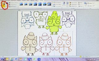
In this screen shot I have already selected and colored several images.  Arranging images close is possible with png files.  If you are using jpeg images you will have that white box fixed around the image and waste paper.  Make sure your digi stamps are high resolution and a .png file.


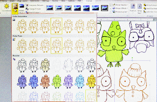
The screen shot on the left shows you the many color options in the pull-out menu.  You will have a choice of tone, saturation, and color fill (which is kind of cool because the outline remains black and the image is a solid fill).
What if you want to customize your colors and go beyond the options in view?
At the bottom of the menu you will discover there are additional tools to select color variations or customize your own colors.
 I like to print on a nice white cardstock that takes media well.  My preference is Strathmore 88 lb. cover Bristol in Ultimate White.  It's an elegant paper and makes lovely note cards as well.

Before you print check your print settings.  To get a deep crisp outline be sure to select best quality  (or photo quality) as many printers have ink saving features and will default to draft print.


Any questions?  Please contact me at:  janet@veralanestudio.com